The last week in August, on a beautiful sunny day, Dave and I
headed up the coast of the North Shore to Salisbury, Massachusetts to join a
select few design bloggers and members of the press who were invited for a
sneak peek at “Design Home 2014.”

The Design Home, sponsored by Boston magazine,
will be opening for public tours from September 10th through October
6th. One hundred percent of
the proceeds from ticket sales will benefit Boston Children’s Hospital, so by
visiting you will not only be getting some wonderful design ideas and
inspiration but also contributing to a great cause.
Not only is the philanthropy an admirable one,
but you will also see firsthand how building and decorating a home can be
friendly to the environment. This is
Boston magazine’s first zero-energy Design Home, since they began ten years
ago. It is a 2,400 square foot single-family
modular home built using energy-efficient construction techniques and systems,
as well as eco-friendly finishes and furnishings. Considered a “net zero-energy” structure, it
will generate as much renewable energy as it consumes each year... actually a
surplus, meaning that it contributes to the grid rather than takes from it.
Another difference this year is that the
homeowners were involved in the entire process, and the end result is their
family home, not just a show space.
Natalie and Tom Treat are both interested in living a more energy
efficient life personally, while also being involved with the mission on a
professional level. They wanted a home
outside of the city that would not only be quieter and more rural in feel, but
also reduce their carbon footprint. When
they were not able to find a suitable existing home, they embarked on the
journey to create one.
Their first step in the process was to work with
BrightBuilt Home, a line of modular, high performance, low-energy homes
designed by Kaplan Thompson Architects.
I am personally a huge fan of modular construction... Because modular homes are built in climate
controlled facilities, the condition of the materials are not subject to
weather, and additionally there is greater potential for higher levels of
accuracy than most site-built situations.
If you want to see how cool it is when the modules come together on site, check out the time-lapsed video on the "Design Home 2014" website (also for additional details on all aspects of the home’s sustainable story). The Design Home was built by Ridgeview Construction who focuses on green building in New England.
The home’s exterior has a relaxed, country feel
to it, with its board and batten style siding running both vertically and
horizontally. Tim Opgenorth, Project
manager at Ridgeview Construction made the point that “While the design and
choice of materials are important, it’s the details of how a house is put
together that’s crucial.” One of the
details that he was referring to is orienting the building for maximum solar
gain. The roof on the south facing side
of the home is clad in SunBug Solar panels which are estimated to produce 104 %
of the home’s electricity needs per year while not detracting at all to the
look of the home!


The Front Entry is covered in a lean-to style roof that protects residents and guests from the elements, important as this is the main entrance to the home.

The spaces in Design Home coordinated by LisaWasserman Sivan, a Brookline-based architect and designer who “believes deeply
in eco-conscious design, particularly when it comes to scale.” She worked with the homeowners to select the
interior finishes, colors palette, and kitchen layout. Lisa worked with the sponsors that were
involved in decorating the spaces throughout the home to ensure a unified flow
and green sensibilities.
Once inside, the interior entry must do double
duty as a guest receiving area while regularly performing everyday functions,
such as a place to drop the spoils of a shopping trip! The space was designed by Ray Bachand of
60nobscot Home, who included a serene painting from the Walsingham Gallery that
speaks to the coastal location of the home and adds a welcoming touch.

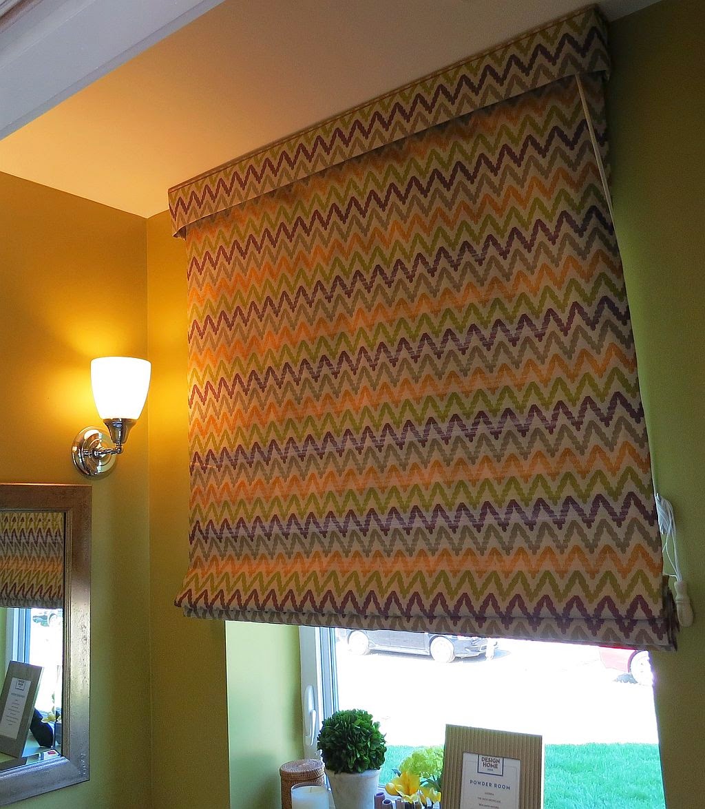
Right off the Front Entry, the Powder Room is
less relaxed and a bit bolder. The walls
are painted an intense sagey-green called “Wasabi,” by Benjamin Moore, and the
window is treated to a Roman shade fabricated by Adorna, who did the window treatments throughout the house, in a
wasabi-eggplant-goldenrod zig-zaggy chevron fabric.

Like the entry, the Family Room has to work hard as a multipurpose space. It will serve as the family’s day-to-day place to relax and watch tv, but also where they will entertain when company comes a calling. Even though it is not a huge room, Lynn Dayton of Dayton Home created a furniture layout and chose styles that allow for flexibility. When catching up with friends or family is the goal, the sofa and chairs make for a lovely conversation area. But when all eyes are on a movie, the chairs swivel around and everyone can watch comfortably. I can relate to the success of this layout in my own home where I created a similar multi-use floor plan! The star of the show, and common denominator in the color palette of the room, is a stunning earth- and jewel-toned rug made of repurposed silk saris from Landry & Arcari. The linen draperies and toss pillows give a nod to the natural, green theme of the residence.


The Dining Room has to be casual enough for everyday family meals while also getting a bit gussied up for special occasions. The dark-toned pedestal table and upholstered side chairs, from Dayton Home, fill the bill. The linen draperies feature a leaf motif, mirroring the view outside and adding to the green concept. Landry & Arcari’s rug began as a 1930’s Persian Tabriz, but was too worn out to reweave… so the pile was sheared down resulting in an up-to-the-moment look while extending its life… now that is “sustainability!”


The Kitchen is considered the heart of the home, and it indeed was when we visited for our tour… so the photograph has as many people in it as cabinets… which by the way were custom crafted in walnut in the Shaker style by Jewett Farms + Co., who also did all of the reclaimed hardwood flooring, sourced from old barns and mills, throughout the home.

The Screened Porch, which is right off of the Dining Room, has an up-north vacation home vibe. The natural stained wood framing and beadboard cladding on the gabled ceiling add to the open, airy feel. As a three-season space, it was important to outfit it with indoor/outdoor furniture, and the sectional from YankeeFireplace looks like the perfect spot to relax with your morning coffee and newspaper, a great book and some lemonade (this could possibly result in a nap!), or entertain friends.


As you climb the stairs to the Second Floor, you are greeted by a pair of salt marsh themed oil paintings from the Walsingham Gallery. The Hall itself runs almost the width of the home connecting the Bedrooms, Bath, Office and Laundry Room. Traveling up and down the Hall, your feet are treated to a 16’ long Turkmen over-dyed runner from Landry & Arcari.


The Master Bedroom is enveloped in soft tones of
gray and white with the occasional introduction of lush wisteria fabrics. The focal point of the room, which was
designed by Kerry Vaughn of Red Bird Trading Co., is a four-poster bed wrapped
in a cross hatch pattern gray grass cloth, which adds elegance to the space
while still keeping it open and airy. Lacquer
nightstands, a Parsons-style dressing table in front of an oversized distressed
wood framed mirror add some glitz and a touch of femininity.


The adjoining En Suite Master Bathroom includes water saving Kohler plumbing fixtures and a custom vanity from Jewett Farms + Co.

At the opposite end of the Hall, the Guest Bedroom is a combination of light and airy, and exotic and intriguing. Emily Lacouture, of Now Interior Design Studio, re-purposed a vintage 1960’s hand-painted folding screen in midnight blue and brassy gold circles, from France, as her muse. The rest of the space bows to the stepped headboard in creams and golds. A brass bar cart doing duty as a nightstand, and the retro off-white with gold credenza, add to the sophistication of the room.


The Kid’s Bedroom next door is a bright, cherry space done in black and white palette with neon and primary accents, designed by Emily Lacouture of Now. The combination of geometric patterns and animal prints and accessories adds to the fun of the space, which is suitable for a boy or girl, and all ages welcome!


Since the Family Bath will be utilized by both children and guests, appealing to both was key. The coastal aqua wall color “Wythe Blue,” from Benjamin Moore’s new Colonial Williamsburg collection, combined with glistening white open up the small space. The rattan framed mirror and aqua striped Turkish towel from Now, and art from Walsingham Gallery lend a nod to the shore.


The Laundry Room is on the Second Floor, which makes sense on many levels, so to speak. That is where most of the laundry in a household is generated, and from an energy perspective, it makes sense not to heat a basement just so you can do laundry down there. And laundry seems like much less of a chore in this room that is not only convenient, but filled with natural light (not so much in a basement!), lovely coastal artwork, and a stacked state-of-the-art Samsung washer and dryer.


A diminutive Office is tucked between the Family Bath and Stairway. A custom built, modular home office piece was hand crafted by Ray Bachand of 60nobscot Home to span the entire depth of the room. The space is ready for computer work, reading, writing, and storage, all in a small package. The warm tones on the walls are complimented perfectly by the black walnut and cherry woods of the furniture, and a rich vintage Moroccan Berber rug woven in tones of saffron and hazelnut, from Landry & Arcari.


Most homes in New England have a space under the gable part of their roofs… flat roofs for residential buildings just don’t make a lot of sense in this climate The spaces that result are commonly used for storage, or on occasion transformed into a bedroom. The Design Home has a huge third floor space that spans the entire length and width of the house, so it would be a shame not to put it to use as actual living space… especially since it is the single biggest room in the house! And thus, the Loft was born.
One of the reasons that the space works so well is the inclusion of several good-sized windows during the design phase of the project. Light flows in from both ends of the room as well as the stairwell which features a window above the landing. Existing homes that convert the attic space to other functions usually don’t have the benefit of large windows, and if the divide the space with multiple walls, they also don’t get the flow-through light. Keeping the palette pale and neutral adds to the understated elegance.
Kerry Vaughn, of Red Bird Trading Co., envisioned
an artist’s atelier as her inspiration. And
because it is such a big room, she divided the space into zones. One end is the artist studio, the middle a
relaxing wine bar, the other end a sophisticated lounge. Although it is quite luxurious, it still
features natural materials and reworked pieces.


So, that is our tour… isn’t it hard to believe
that you can do so much green living in such a striking fashion in only 2,400
square feet? Please take advantage of
the lovely late summer weather and make a drive to Salisbury to tour the house
in person… you’ll leave inspired, and will be helping Boston Children’s
Hospital. For more info, check out
Design Home 2014. Let me know what you
think!

Please note: all original photography by David
Hawkins – not to be used without permission.


